The Art and Impact of Colour Psychology in Interior Design
In the world of interior design, careful selection of colours holds an important part in determining the tone and mood of a space. Colour is more than just aesthetics; it can impact feelings, behaviour, and overall well-being. Understanding colour psychology in interior design may help you create the ideal atmosphere in each place, whether you want to inspire passion in the bedroom or boost productivity in the home office. In this blog, we will delve into the fascinating world of colour psychology in interior design, looking at how different colours may elicit certain emotions, generate moods, and contribute to the overall ambience of a space.
What is Colour Psychology?
The study of how colour influences human behaviour and emotions is known as colour psychology. Human mood and decision-making are influenced by the unique connections that are evoked by various colours, hues, and tones. Colour psychology can differ based on personal tastes and culture.
Some Key Aspects of Colour Psychology in Interior Design:
Creating Ambience:
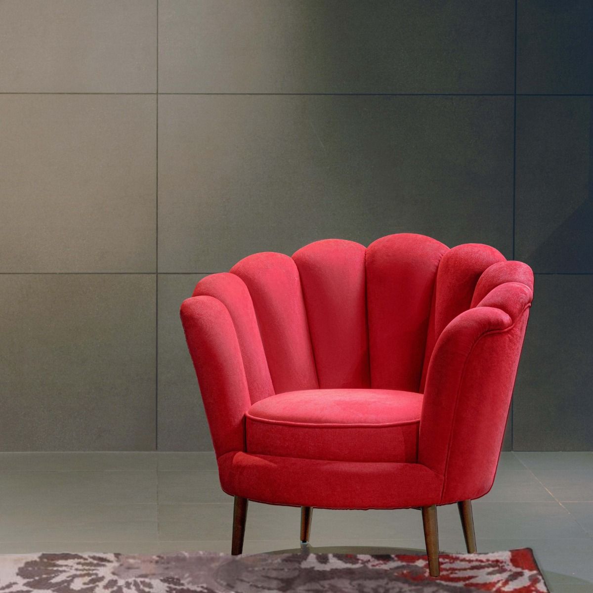
Interior designers use colour to define the overall mood and ambience of a room. Warm colours such as red, orange, and yellow can create a lively and passionate environment, making them ideal for social spaces. Cool tones like blue and green are commonly used in spaces that aim to create a relaxing atmosphere. While decorating your home, be creative and make the most of colour psychology.
Visual Perception and Space:
Colours can impact the perception of space. Darker colours can evoke a feeling of cosiness and intimacy, whereas lighter colours typically give the impression that a room is wider and more open. Colour selection is especially crucial in smaller or irregularly shaped spaces.
Personalisation:
It’s important to consider your personal preferences and lifestyles when selecting the colours. You can create a personalised and emotionally satisfying environment by incorporating colours that resonate with the individuals living in the space.
Establishing Focal Points:
Accent colours are frequently used to draw attention to specific areas of a room. Vibrant or contrasting hues can highlight particular architectural elements, pieces of furniture, or artwork, giving the design more visual depth and attraction.
Harmony and Balance:
Colour harmony and balance play a vital role in interior design as they help to create eye-catching and harmonious rooms. A harmonious colour palette requires careful consideration of the balance of diverse colours, shades, and textures. Effective colour balance adds to a sense of unity, harmony, and general aesthetic balance. This harmony improves a room's visual flow and protects it from looking cluttered or disorganised. A well-balanced colour palette ensures every item in the room complements the others, creating a harmonic mood that is visually appealing and suitable for a pleasant and inviting living environment.
Seasonal Adaptations:
You can enrich places with a feeling of freshness by introducing seasonal features. This could entail adding textures that capture the essence of a specific season, changing colour schemes, or adding seasonal accessories. In addition to expressing the outdoors' cyclical character, seasonal adaptations provide you with a physical and visual link with the season. Whether it's warm and lively colours for spring and summer or comforting textures and earthy tones for winter, these deliberate alterations contribute to a flexible and ever-changing design that keeps spaces current and engaging all year.
The Basics of Color Psychology
Let’s take a look at the fundamentals of colour psychology by providing an overview of how different colours create special feelings and reactions.
Choosing a Palette:
Choosing a palette is a strong tool for communicating a design concept, personalising the space, and creating a harmonious and balanced setting that fits your lifestyle and aesthetics. You can develop a palette that reflects the desired mood and purpose of each area by considering details such as room function, natural light, and personal tastes.
Cool Colours for Calm Haven:
In interior design, the incorporation of cool colours is instrumental in creating serene retreats within a home. Cool hues, such as blues and greens, have a calming effect on the mind and contribute to a sense of relaxation and peace. These colours are often associated with nature, water, and open skies, evoking a soothing and refreshing ambience. Whether used in bedrooms, bathrooms, or lounging areas, cool colours can visually expand spaces and promote a sense of tranquillity, making them ideal for areas where unwinding and rejuvenation are priorities. The strategic use of cool colours in interior design not only enhances the visual appeal of a space but also fosters an atmosphere that encourages restfulness and a retreat from the demands of daily life.
Warm Hues to Enhance Spaces:
Warm colours play an important part in interior design by giving a sense of warmth, brightness, and energy. Warm colours like orange, yellow, and red may ignite thoughts of cosiness and create a welcoming environment. Warm colours have the power to add a touch of life when effectively added to spaces such as living spaces, dining areas, or kitchens. These colours also help to create a welcoming environment, making rooms feel more cosy. Warm hues in interior design create an atmosphere that is not only visually appealing but also emotionally exciting, ensuring that people feel comfortable and connected within their living spaces.
Neutral Colors for Timeless Elegance:
Neutral colours play an essential role in interior design by providing a timeless and elegant foundation for various living spaces. Whites, greys, and earth tones create a versatile backdrop that compliments a variety of design styles and allows for creative decorating. The subtlety of neutral hues assures that they will last, avoiding trends and allowing for easy adaptation to shifting preferences. Neutral colours are not only aesthetically pleasing, but also create an elegant and peaceful atmosphere that draws attention to the furnishings, artwork, and architectural details. Whether applied as the primary palette or as a secondary element, neutral colours in interior design create a classic elegance, allowing people to experience a subtle and timeless aesthetic that can endure the passage of design trends.
Trends in Color Psychology:
Keeping up with colour psychology trends is essential in current interior design because it helps you to be imaginative and adaptable to changing aesthetic preferences. Colour psychology trends reflect changes in society's tastes, lifestyles, and even environmental consciousness. By incorporating these trends you can ensure that your design remains visually compelling and relevant.
Lighting and Context:
Lighting can affect the appearance of colours. Colour perception can be affected by both artificial and natural light, so take the lighting in the space into account when selecting colours.
Conclusion:
In summary, exploring the practice of colour psychology in interior design reveals a world in which colours are more than just decorative elements; they are also effective tools that can influence the mood, functionality, and general ambience of living areas. The thoughtful use of colours turns a house into a canvas on which feelings are conveyed and experiences are handpicked. Allow colour to serve as the palette with which we paint the story of our lives, creating environments that are not only aesthetically pleasing but also seamlessly align with our feelings, goals, and changing ways of living.